Embracing the Era of Mobile Device Standardization

Embracing the Era of Mobile Device Standardization
Quick Links
The year is 2024. Smartphones are not a new or novel concept—everyone has one. Yet, Apple, Samsung, Google, and many other companies are releasing new phones every year. That’s what they tell us, at least. Your eyes may tell a different story.
For those of us who witnessed the incredible explosion of smartphone popularity in the early 2000s, it’s hard to believe we’re nearly two decades removed from the original iPhone announcement. There’s been an astounding number of devices launched since then, and most of them have been very unique. Over time, like jagged rocks going through a tumbler, that uniqueness has been polished away.
A Sea of Sameness
In the last few years, the major players in smartphones have seemed to settle on design identities for their devices. The year-over-year design changes are so minuscule that we’re millimeters away from being able to use last-generation cases on new phones . Apple and Samsung are two of the biggest offenders, but Google is starting to do the same thing.
We’ll start with Apple, which is by far the most guilty party. I started with the most recent iPhone as of this writing, the iPhone 15, and went back over previous generations until I found noticeable design changes. That led me all the way to the iPhone 11.
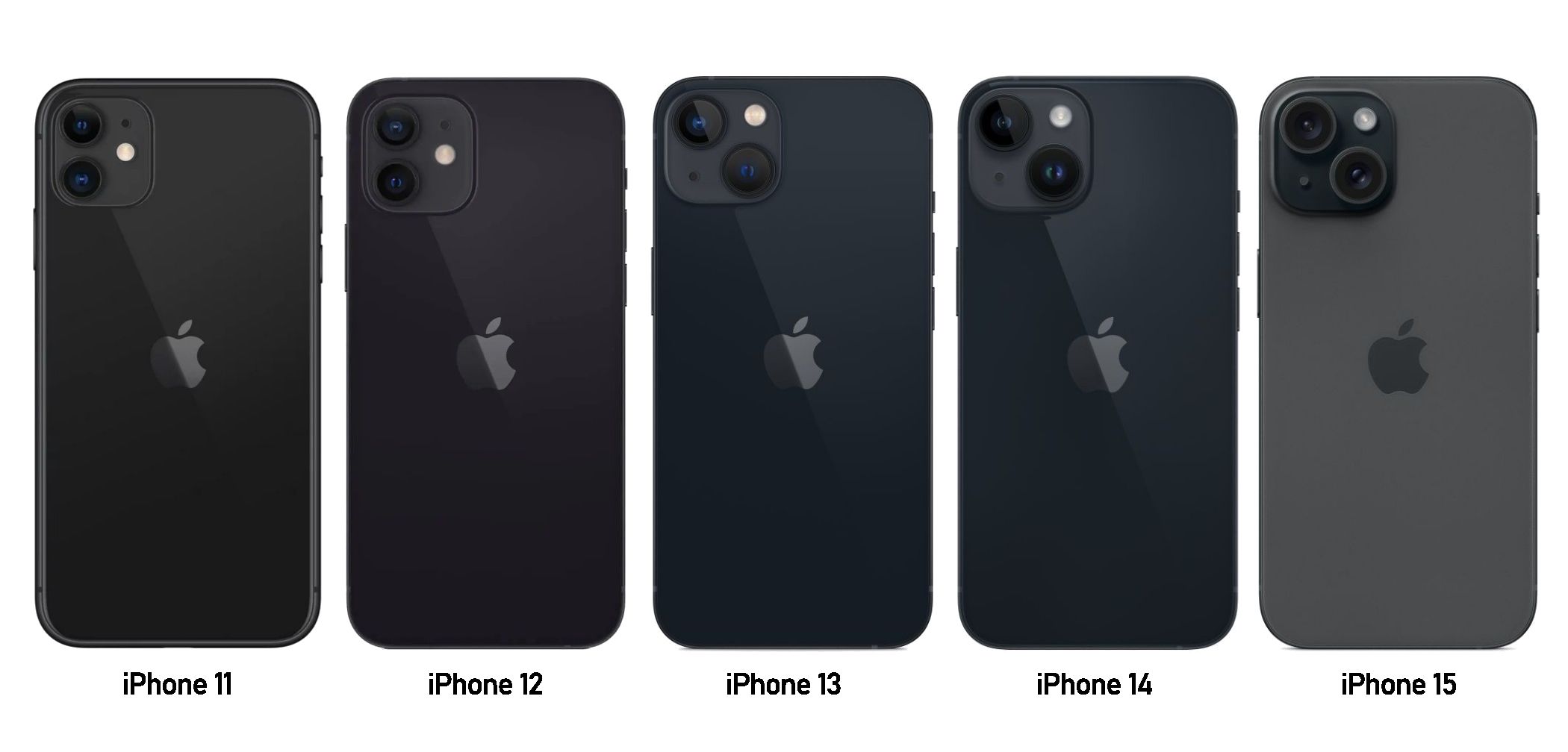
In five generations, the biggest design changes are moving the cameras from stacked vertically to diagonal and a switch from glossy to matte glass. The last three generations, in particular, are essentially identical. You’d need to have a very keen eye to tell the iPhone 13 and 14 apart.
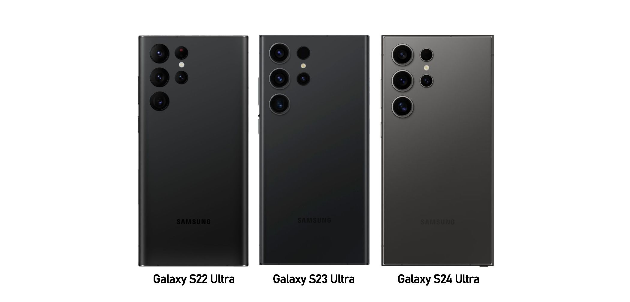
For Samsung, I was able to go back three generations before finding discernable changes. While the company has maintained the same arrangement of five cameras and a flash since the Galaxy S20 Ultra, it played with the housing for a couple of years. That is until the S22 Ultra, which has now been repeated three times.
![]()
Google is definitely the least offensive of the three, but I get the sense this is just the beginning. Google had a two-tone aesthetic going from the OG Pixel to the Pixel 3, then an iPhone-esque look with the Pixel 4 and Pixel 5, and we’ve seen this camera bar design for three generations now. The same design has also been used for the Pixel 6a and Pixel 7a (and almost certainly for the Pixel 8a as well).
That’s the smartphone landscape of today. There are, of course, many other great devices from a variety of manufacturers, but Apple, Samsung, and Google are responsible for a majority of the phones seen out in the wild in the U.S.
When Phones Were Fun
The early days of smartphones were wild times. Manufacturers were trying to figure out how people wanted to use these new devices. The touchscreen was obviously an essential component, but other than that, almost everything else was up for grabs. It was as if someone threw a bunch of keyboards, trackballs, buttons, materials, and cases into a machine and pulled a “Randomize” lever.
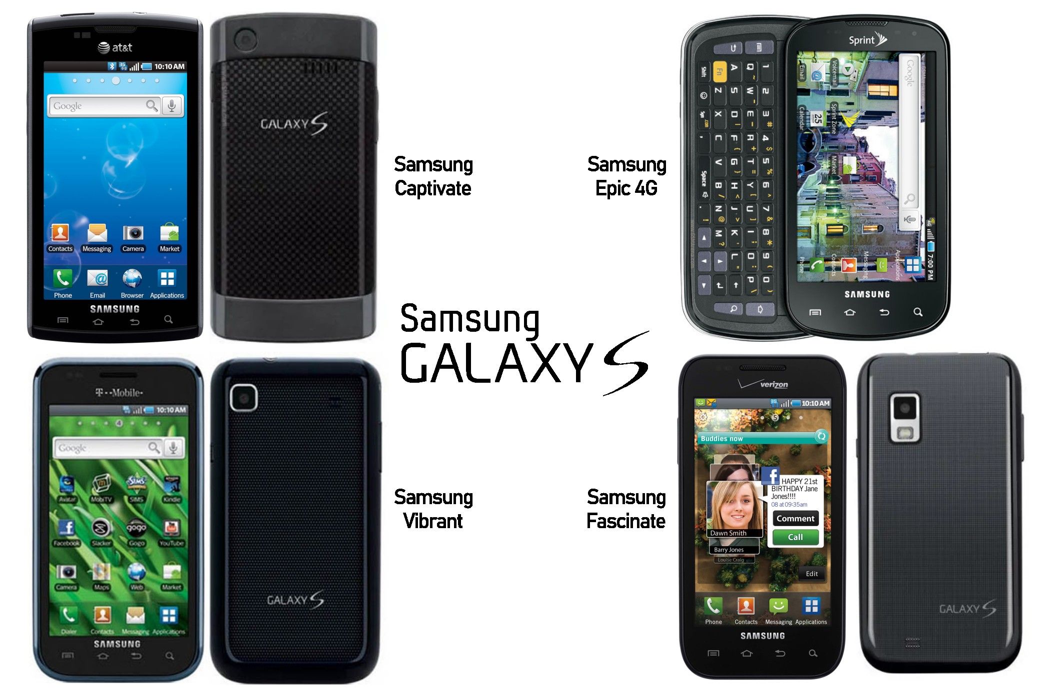
The other part of the equation was U.S. carriers. AT&T, Sprint, T-Mobile, and Verizon all wanted to have unique offerings. Apple had the power to say no to these requests, but companies like Samsung, who didn’t have that popularity yet, had to play ball. The Samsung Galaxy S series from 2010 is the perfect example.
You wouldn’t know it by looking, but the four phones in the image above are all from the same series. Known in most places as simply the “Galaxy S,” the U.S. saw four models with not only unique names but completely unique designs. It’s hard to imagine Samsung creating four separate looks for the Galaxy S24 series nowadays.
That’s an extreme example, but it shows the variety of smartphones in the early 2010s. Phone makers were seemingly going back to the drawing board with each new phone. Even the iPhone models, which have always maintained consistency between generations, could be told apart just by looking at them.
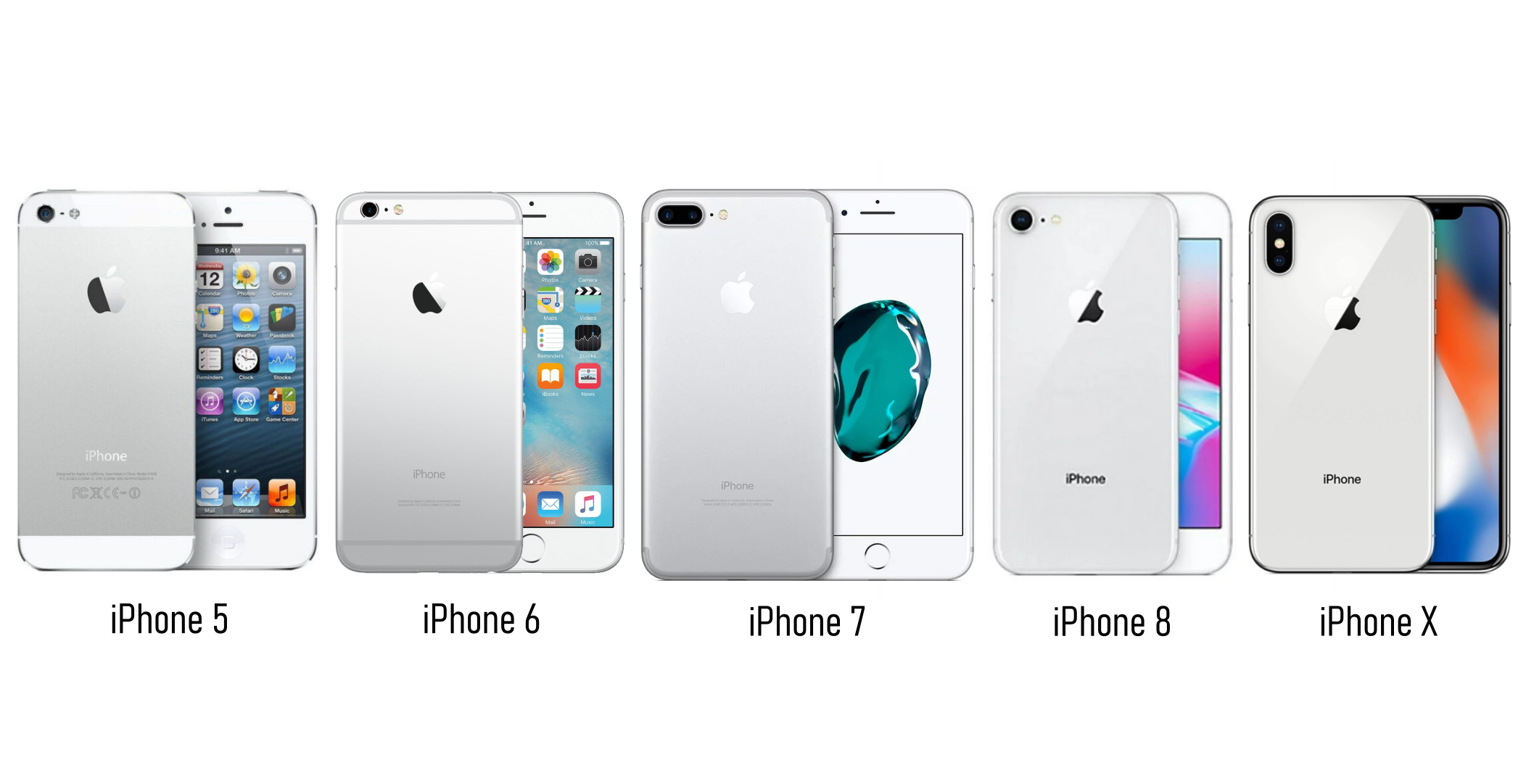
Tha image above shows a lot more variety than seen in the five generations following the iPhone X. The current state of smartphone design feels pretty uninspired, but there are some legitimate reasons why things have moved this way.
How Did We Get Here?
As mentioned earlier, companies didn’t know how people wanted to use smartphones in those early days. Over time, through numerous iterations and failed experiments, that’s more or less been decided. Most people don’t want a physical keyboard. People like big screens. People want a lot of cameras. People want their phones to be waterproof.
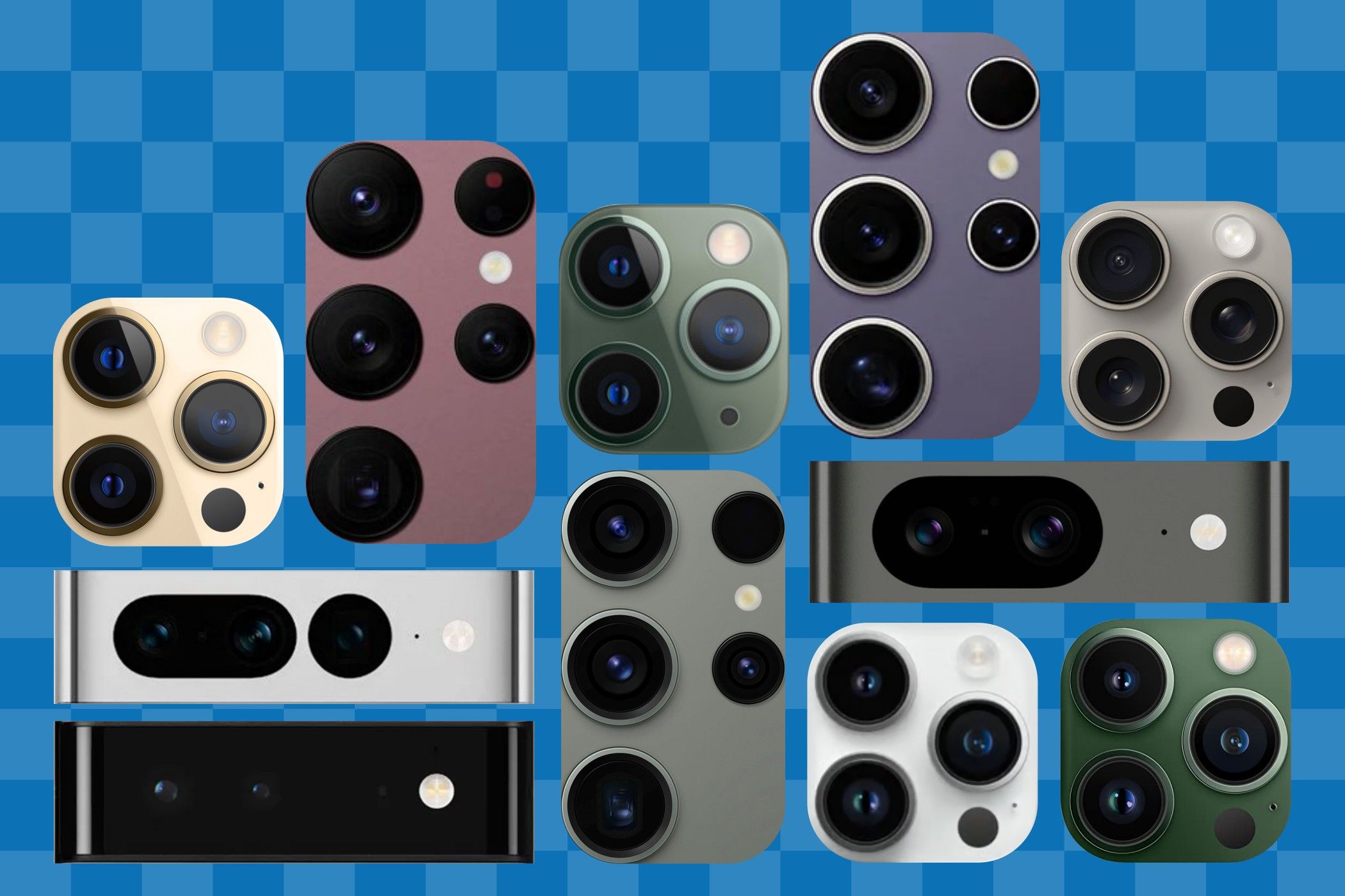
Smartphone design has followed those cues . Physical keyboards and moving parts were eliminated. Front-facing buttons were removed in favor of maximizing screen size. The number of cameras on the back of phones slowly increased. Now, we have blank front slabs and trypophobia-inducing camera arrays as far as the eye can see.
Brand recognition plays an important part in this phenomenon as well. The iPhone has essentially always looked like an iPhone, but Samsung and Google have struggled to achieve that same level of recognition. Sticking with the same design year after year builds familiarity. The Pixel camera bar is distinctly Pixel, for example. Nothing else on the market looks like it.
For that reason, it’s hard to get too upset about the lack of creativity in smartphone design these days. While I certainly miss those Wild West early days, I can understand why we’re here. Smartphones are a utility tool. All the extraneous stuff has been trimmed away. The good news is phones are still pretty cool, even if they do all look the same.
Also read:
- [New] Full Scope Understanding Online Performance Artists for 2024
- [New] Gain Massive Viewership with a Small Financial Investment
- 2024 Approved Harnessing the Potential of Quantum HDR Imaging
- Convertir Facilement Des CAF Vers OGG Sans Frais - Services De Conversion Vidéo Experts Chez Movavi
- In 2024, Elevate Your Banner Game Mastering Visual Branding Techniques
- Realtek RTL8188CU Wi-Fi Drivers Compatible with Windows 11 & 7 - Free Download
- Unfollow Path: Severing Social Media Connections
- Unlock the Secret of Eternal iPhone Charges: Exclusive Tips for Constant Low Power Usage
- Unlocking Simplicity: Using Assistive Features to Convert Modern iPhones Into Fundamental Phones
- Unmatched Value: Why You Should Consider the iPhone 13 as Your Next Phone
- Unveiling the Top Choice in Support Stands: A Comprehensive Review of Kuxiu's X3nova Pro Max for iPads
- Vision Pro’s Uncertain Horizon: My Apprehensions About the Impact of Introducing visionOS 2
- Why Samsung's Device Network Rivalries Apple: Exploring the Strength of Their Unique Ecosystem
- Title: Embracing the Era of Mobile Device Standardization
- Author: Daniel
- Created at : 2024-10-02 18:42:27
- Updated at : 2024-10-06 19:04:30
- Link: https://os-tips.techidaily.com/embracing-the-era-of-mobile-device-standardization/
- License: This work is licensed under CC BY-NC-SA 4.0.
